How might we connect international graduate students with the support resources available at the University of Alberta?
Responsible for
UX Research and Design
The Challenge
Market Context
The University of Alberta hosts a diverse student body of approximately 40,061 individuals from 156 countries, creating a vibrant cultural and academic environment. Hence, equitable access to resources and support for a diverse student body is a challenge.
Initial User Pain Points
• Lack of awareness about available services such as food banks, housing assistance, and wellness programs
• Difficulty finding support resources due to an overcrowded and disorganized main university
website• Struggles to integrate with the campus community
Cost of Problems
• Negative impact on students' overall mental health and academic performance.
• Increased strain on university staff and slowed response time addressing individual student issues
• Underutilization of resources
Solution Framework
The problem's complexity requires divergent thinking and idea generation, making the "Double Diamond" design thinking model the ideal approach.

Approach (Discover and Define)
👥
User Study
Interviews and Surveys with 6 stakeholders (international graduate students)

To understand:
01 Group and community preferences
02 Sought support and resources
03 Digital tools used for learning
04 Campus engagement hurdles
An international student's journey map:

🖥️
Website Expert Review
Analysis of over 24 web pages revealed usability and content issues in the current information presentation.
Limited cultural representation
Assumes familiarity with local systems
Lack of visual support and structure
Lacks introduction to key concepts
🎯
Project Goal
Identify the gaps between the presentation of information and the students’ comprehension of these support resources and elevate the utility of the resources

Building the Solution (Develop)
01 How Might We Questions
"How might we develop a digital solution connecting international graduate students with support resources at the University of Alberta?"
02 Identify user mental models
Following website audits and student feedback (interviews and surveys), I organized the resources based on four key factors:

Card Sorting Exercise
Focusing on just 6 categories with 35 resources, I asked the users to arrange them in a way that made sense to them.

Card Sorting Analysis

Information Architecture

Design Decisions (Design)
The goal was to make the resources at campus visible and comprehensible to the international graduate students.
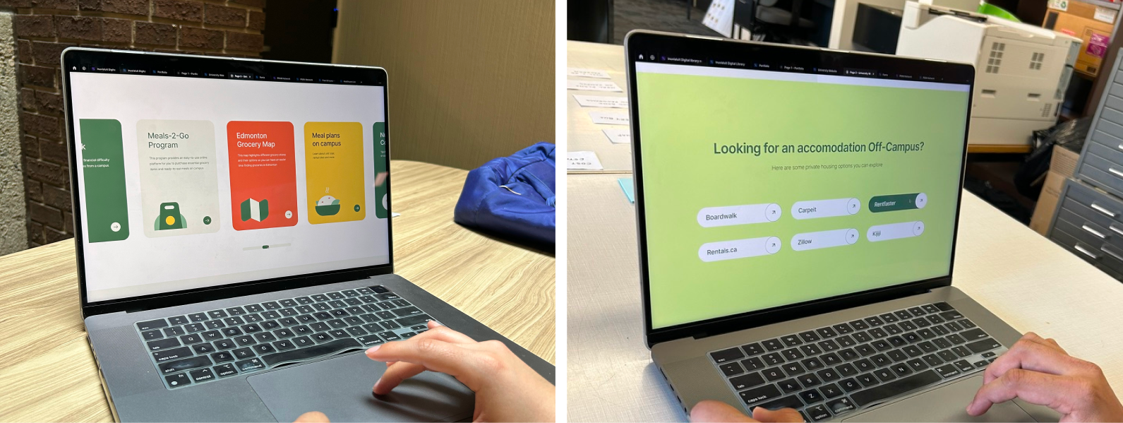
01 To build a microsite
Considering the large number and groups of resources, the concept for "Belong" was emerged, a microsite platform with its own identity that caters to international audience while acting as a starting point to the main website.

Assets


Home screen focused on having a pleasant and calm appearance. Key sections like "International Student Services" and "Documentation" were prioritized and placed on the landing page, each with a brief description outlining their purpose.

03 Card Design
Card design, a short representation of a conceptual unit was chosen to help users focus on one area at a time, thereby reducing cognitive overload and decision fatigue.
Cards also facilitate easy reorganization or the addition and removal of elements, such as resources the University might update over time, making them suitable for modular layouts.

03 Micro Interactions
In health and wellness, the goal is to encourage students to use resources and take action without neglecting their health. Micro interactions support this by conveying intent and motivating users to make positive decisions.
03 Personalisation
A concept of personalisation is introduced to understand more about what the users like and then deliver them with events, clubs, and associations based on their preference. Following si set of proposed questionnaires drawn from user interviews and surveys.
Results after usability and desirability testing
After many rounds of testing and iterations here are the key metrics of our final design
90%
Success rate when asked to find mental health resources. Time on task had an average of 20 secs, as opposed to an avg of 3 mins on the main website.
85%
Expectation matching rate. Users were asked to think aloud while navigating the site to see if what they looked for was easy to find.
80%
Brand attribute matching rate. It aimed to align visually with the main University website More analogies can be added to strengthen relatibility.
Learning and next steps
This was a fun project to work on, especially since I’ve faced similar challenges myself. I think I came up with an effective, low-cost solution by keeping things simple and avoiding the need to move too much content. Now, finding resources is easy, and students were excited to see this project come live.
To make this project happen, we need help from faculty, administrators, and international student service advisors to add more sections like scholarships, include language support, and make it interactive so students can share their experiences. We also need engineers to ensure smooth and detailed implementation.


